Brand Identity & Campaign
KEA Travel & Tours: built for the dirt road
The story
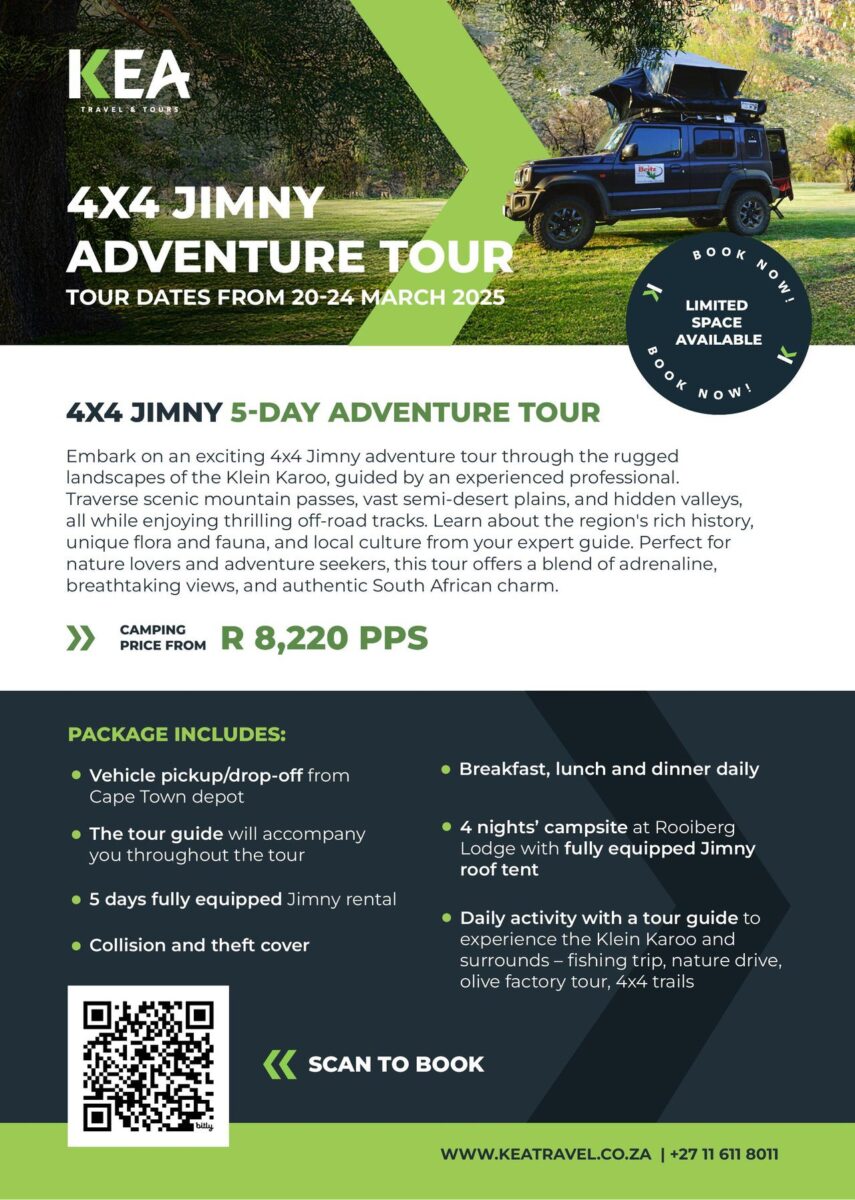
A logo that points the way
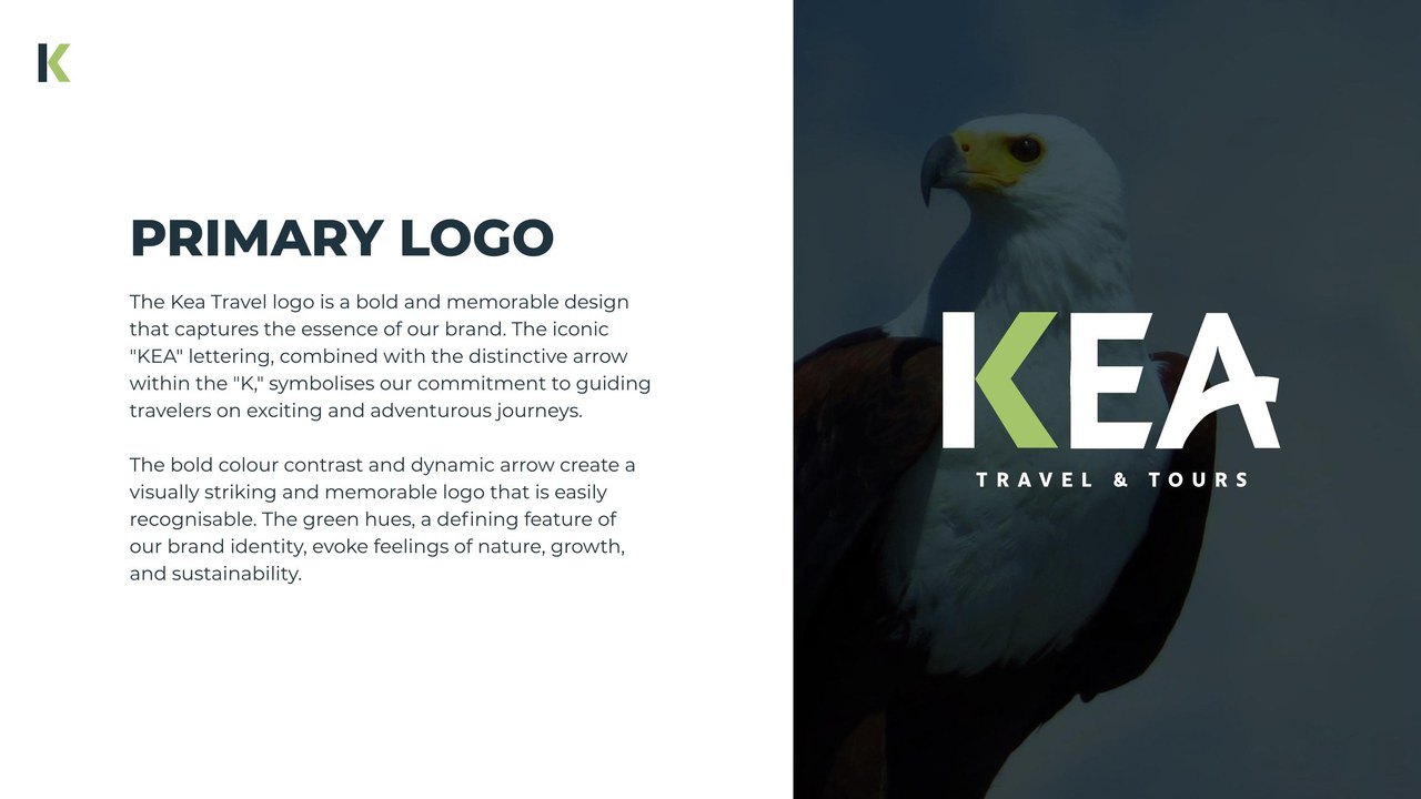
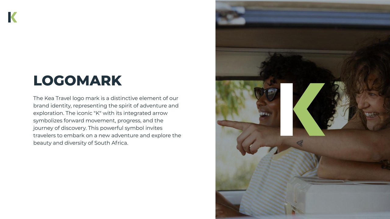
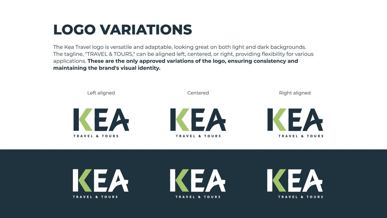
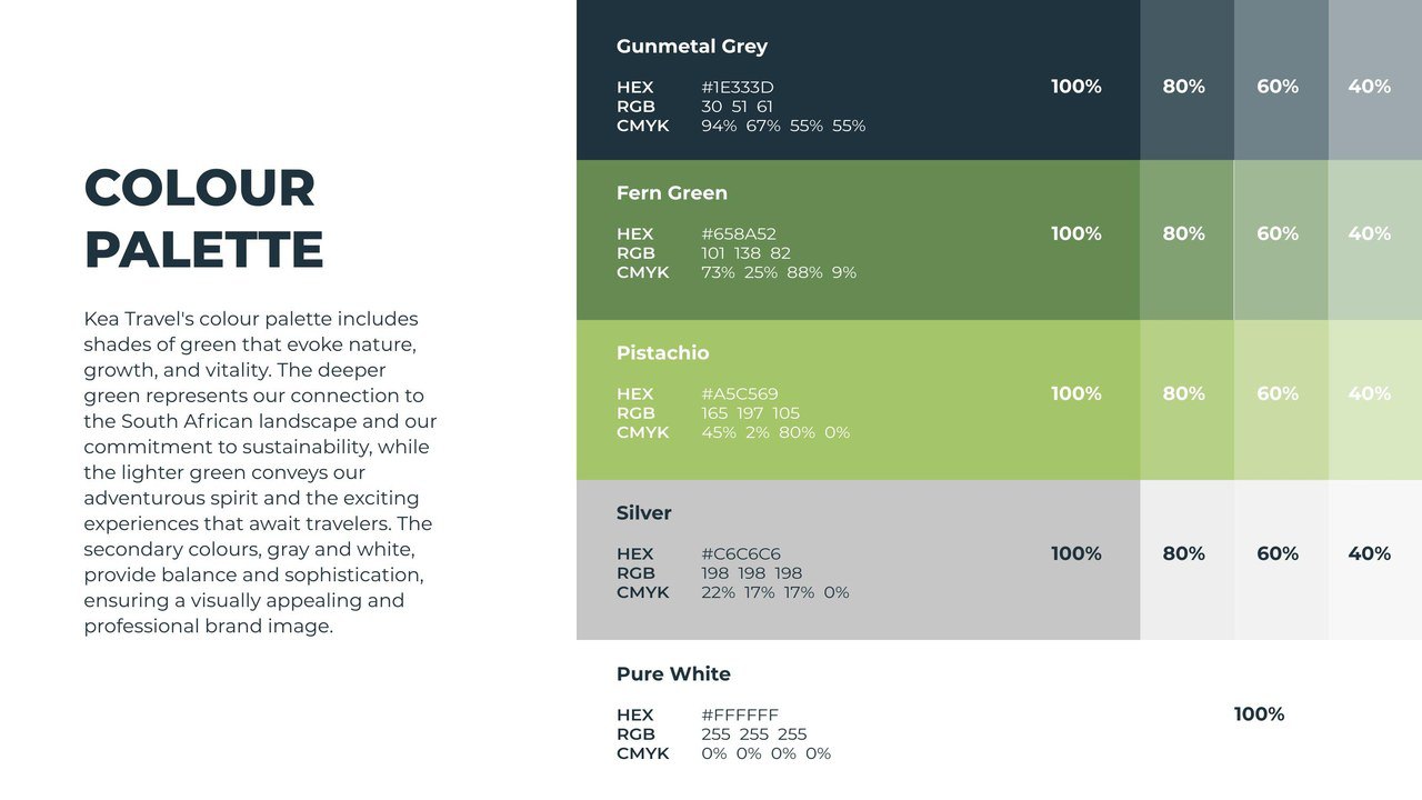
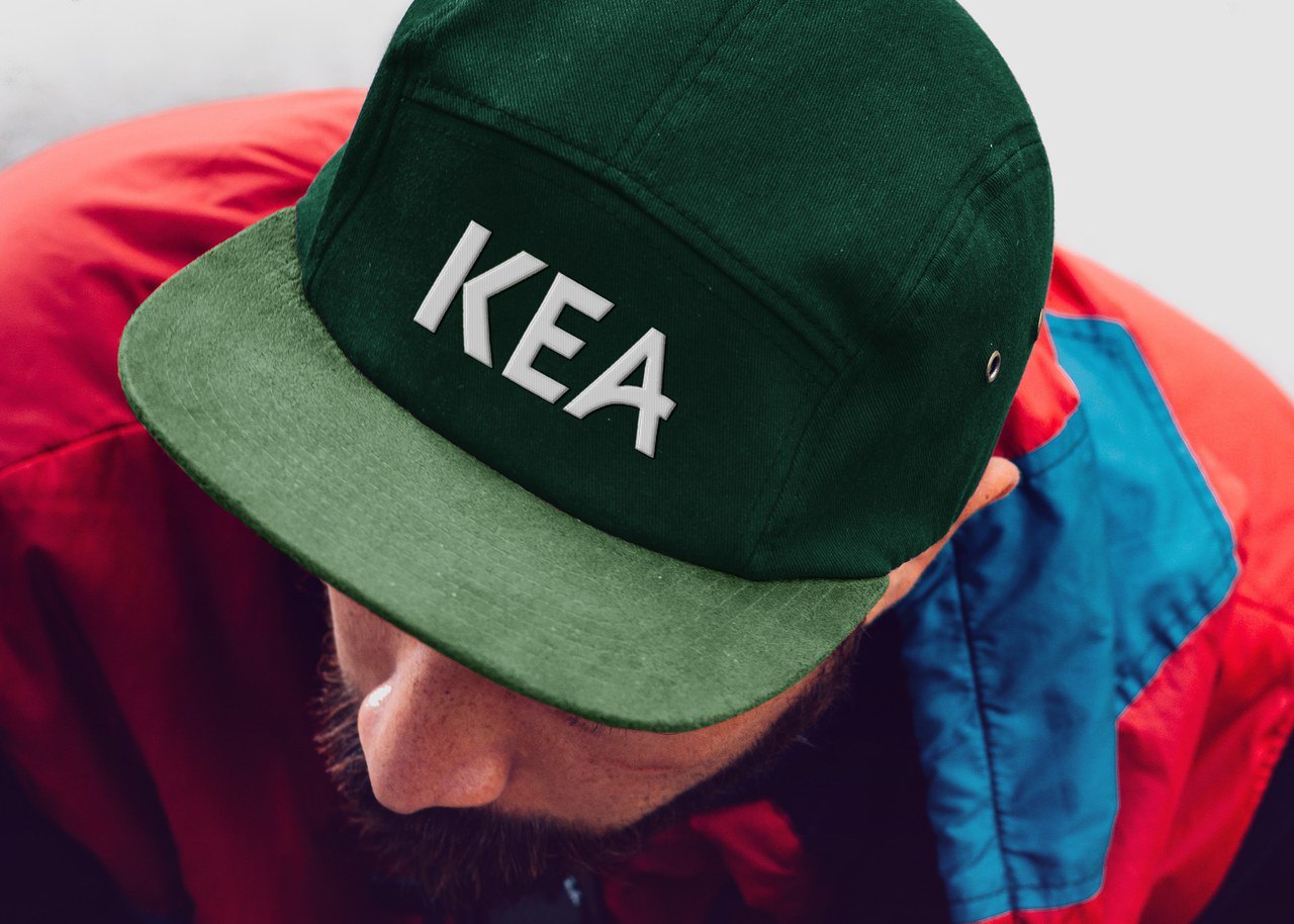
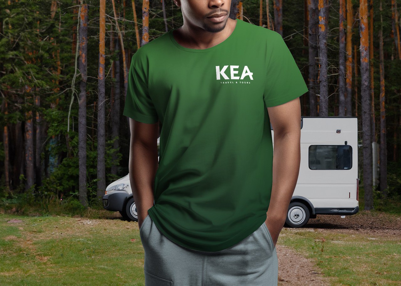
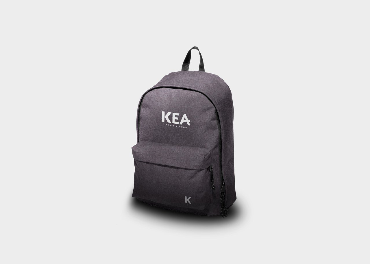
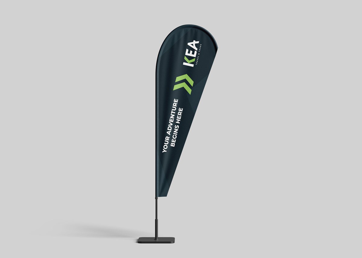
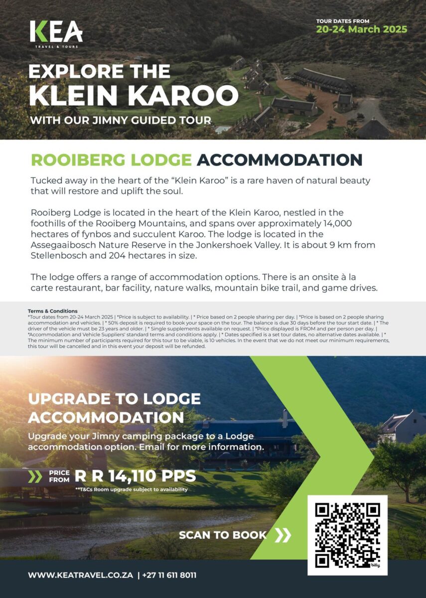
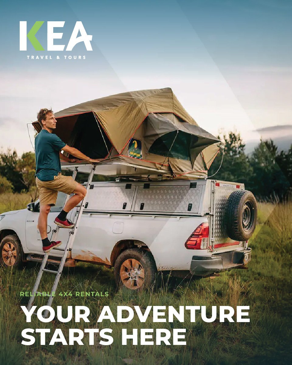
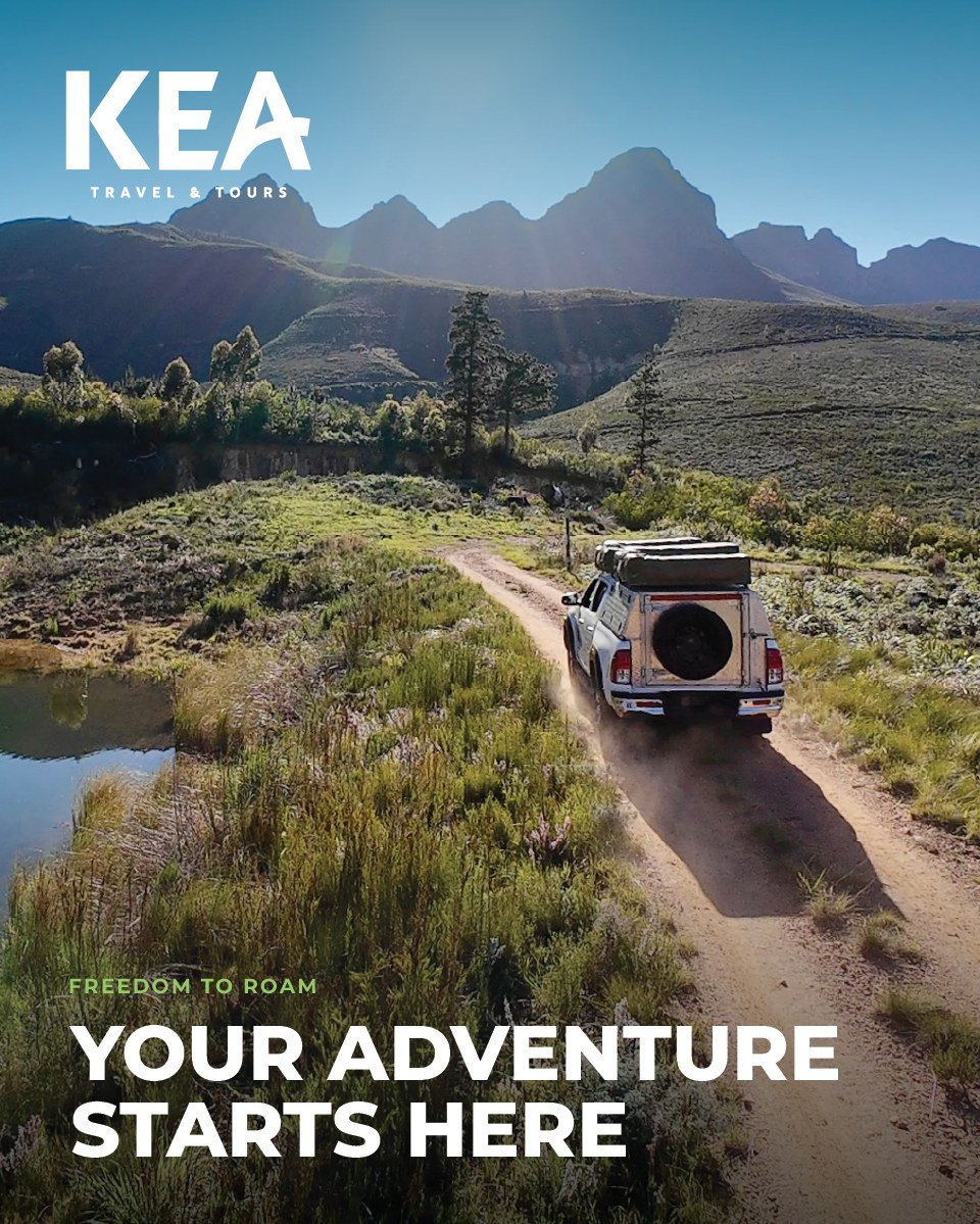
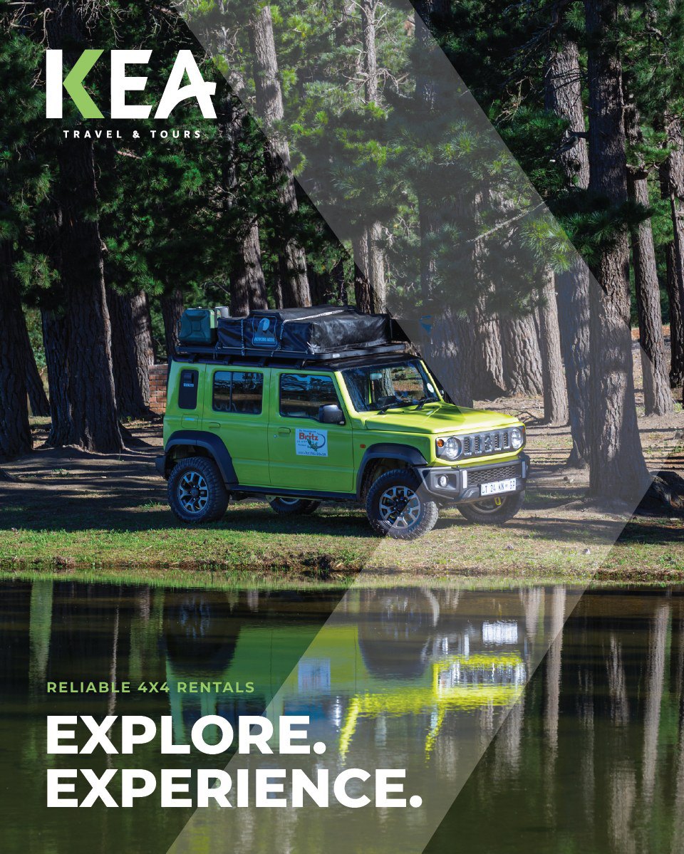
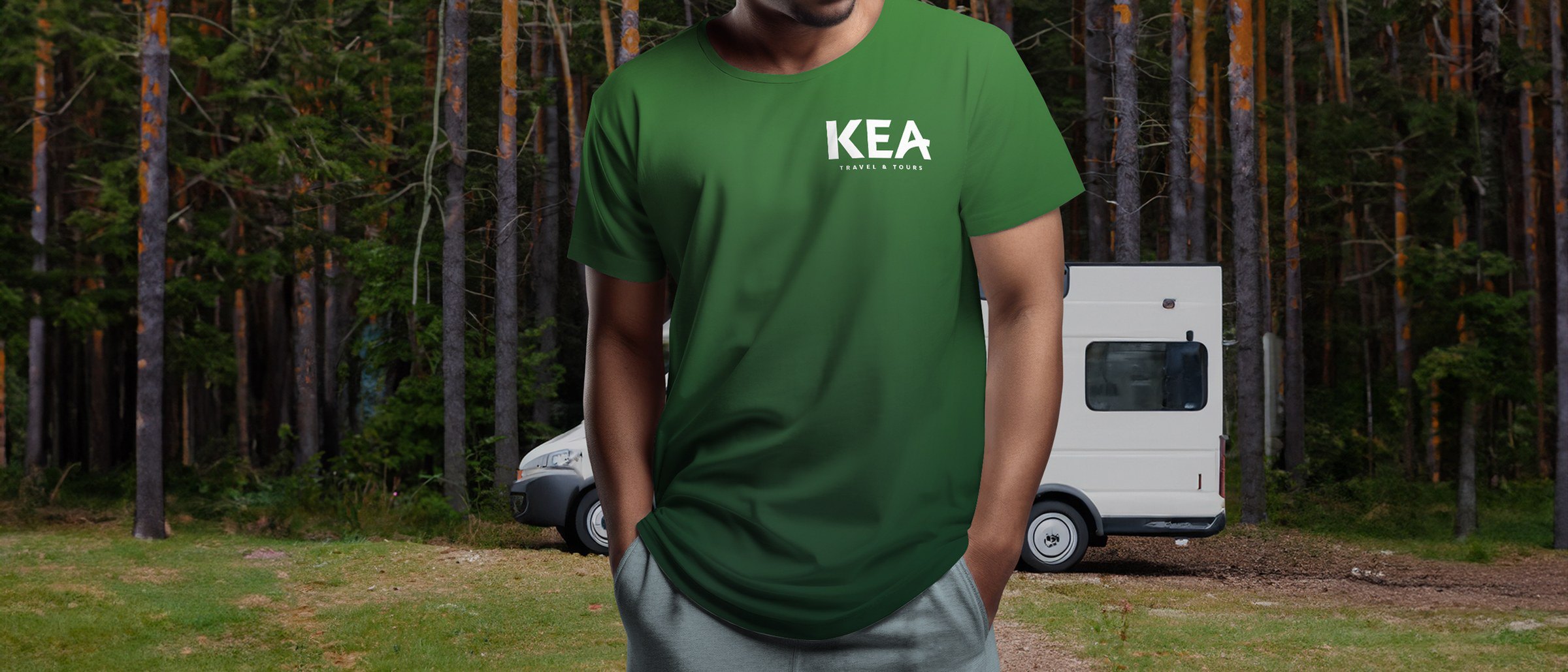
KEA rents 4x4s and runs self-drive adventures across South Africa, and needed a brand that looked at home off the tar. I explored three routes and landed on one with grip: a bold wordmark where the K doubles as a forward chevron, pointing you down the road. Forest green, lime and deep slate keep it rugged and premium. The system then rolled out across merch, print, event flags and a performance ad campaign.
Delivered
- 01Logo exploration & final identity
- 02Brand guidelines
- 03Merch, flyer & teardrop flag
- 04PMAX ad campaign

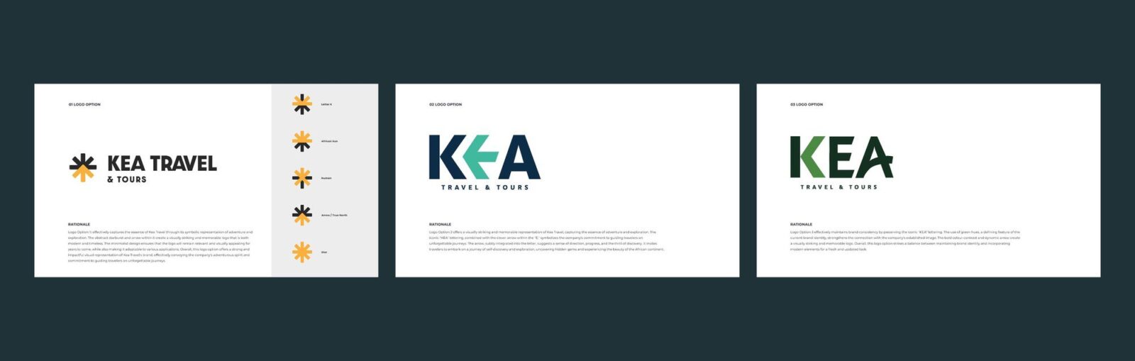
Lead Creative, with the team at Kri8it Digital, 2024 to 2025. All three logo routes were presented to the client; route three was chosen.